
Goodreads' mission is to help readers explore and share books they love. Our mission is to help users enjoy their everyday digital experiences. This project is a visual redesign proposal for the bookaholics' favorite app.
It's not you, it's us
We have been into digital branding for the books industry since 2007, and we like to keep an eye on everything book-related: brand identity for libraries, online shops, publishing houses collections, and, of course, web and mobile apps.
The new Goodreads - clean and responsive design
From designers to developers and project managers, we are all using Goodreads daily, and we are annoyed by the inconsistent design and the outdated look and feel. Regardless of its amazing functionalities, the navigation on the website or app can be very confusing and tiring.
That's why we came up with a new visual identity for Goodreads.
First, let's get structured
Our main challenge was to decide if Goodreads is primarily a social experience focused on the community or a personal experience, where the users track their activity and discover new books. 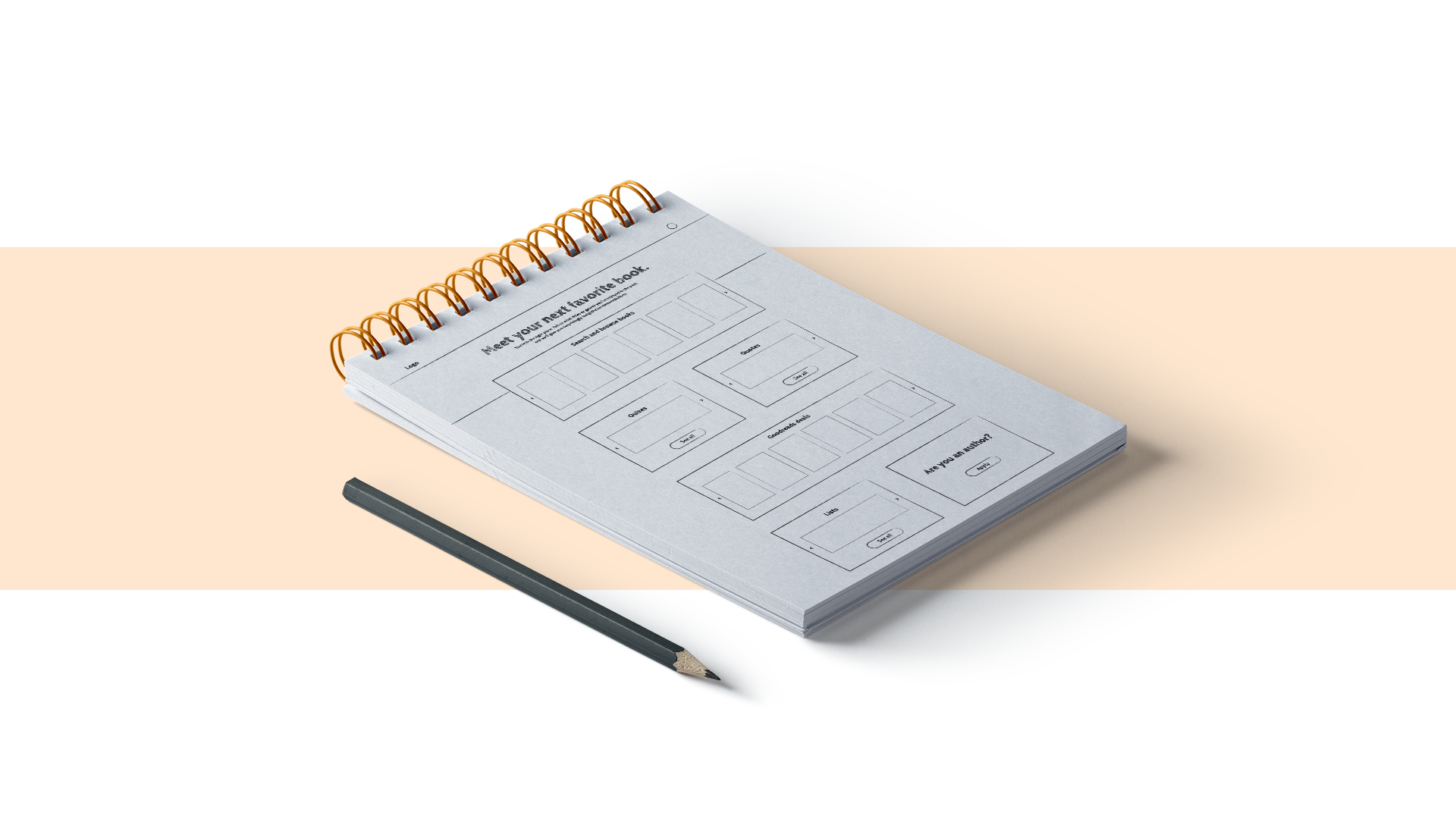
Crude wireframes - defining the structure
After several discussions and versions, we agreed that we should have both, and we defined Goodreads as a shared personal experience.
The next challenge was to create a design that offers both a social experience and a personal one without overcrowding the interface. So we structured all the features and content according to three main directions:
- personal space (my books, my recommendations, discovery)
- content access (lists, deals, blog)
- community (people, events, quizes).

Wireframes - outlining the three main directions
Smart design for smart people
One significant improvement is the new side menu that helps Goodreads users access all sections at one click away without navigating through multiple menus.
Homepage navigation on desktop and mobile
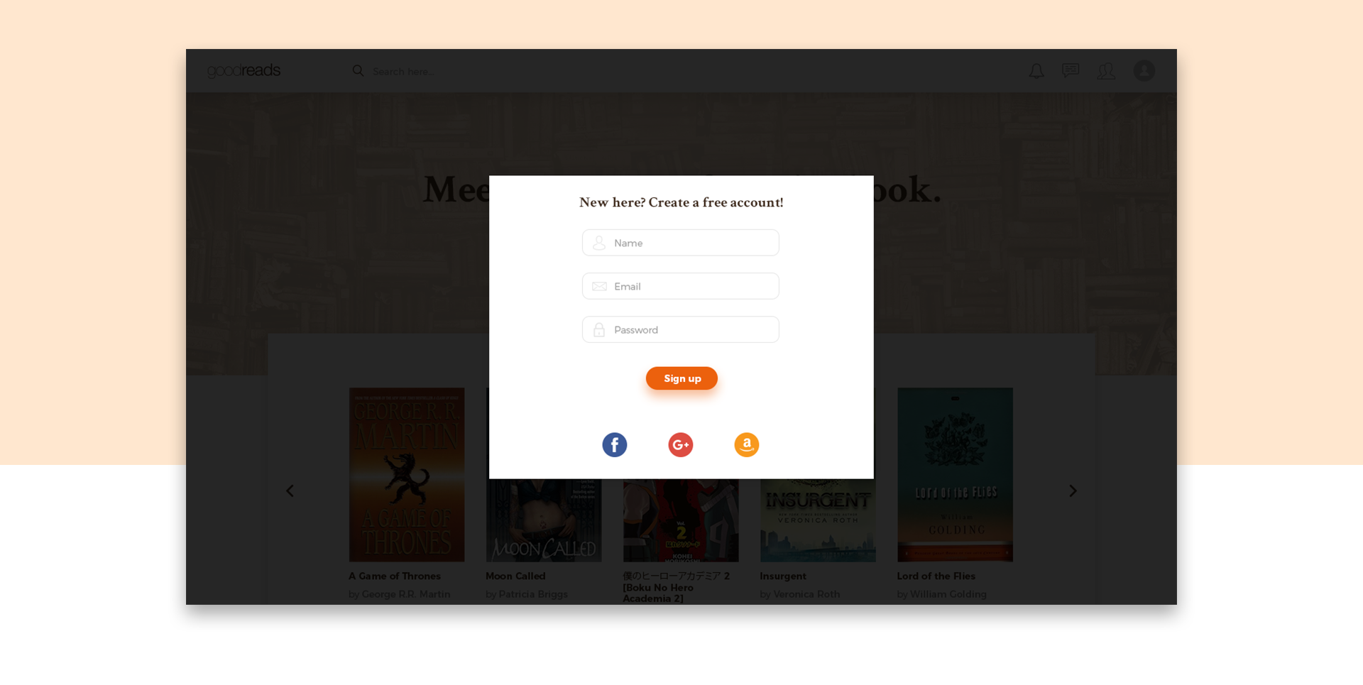
Landing page - meet your favorite books
We designed everything closer to the look and feel of a social network, with card-based design, familiar icons, section placements, and separate community-generated content. To encourage users to explore, we gave more importance to the search area, making it the main section of the header.
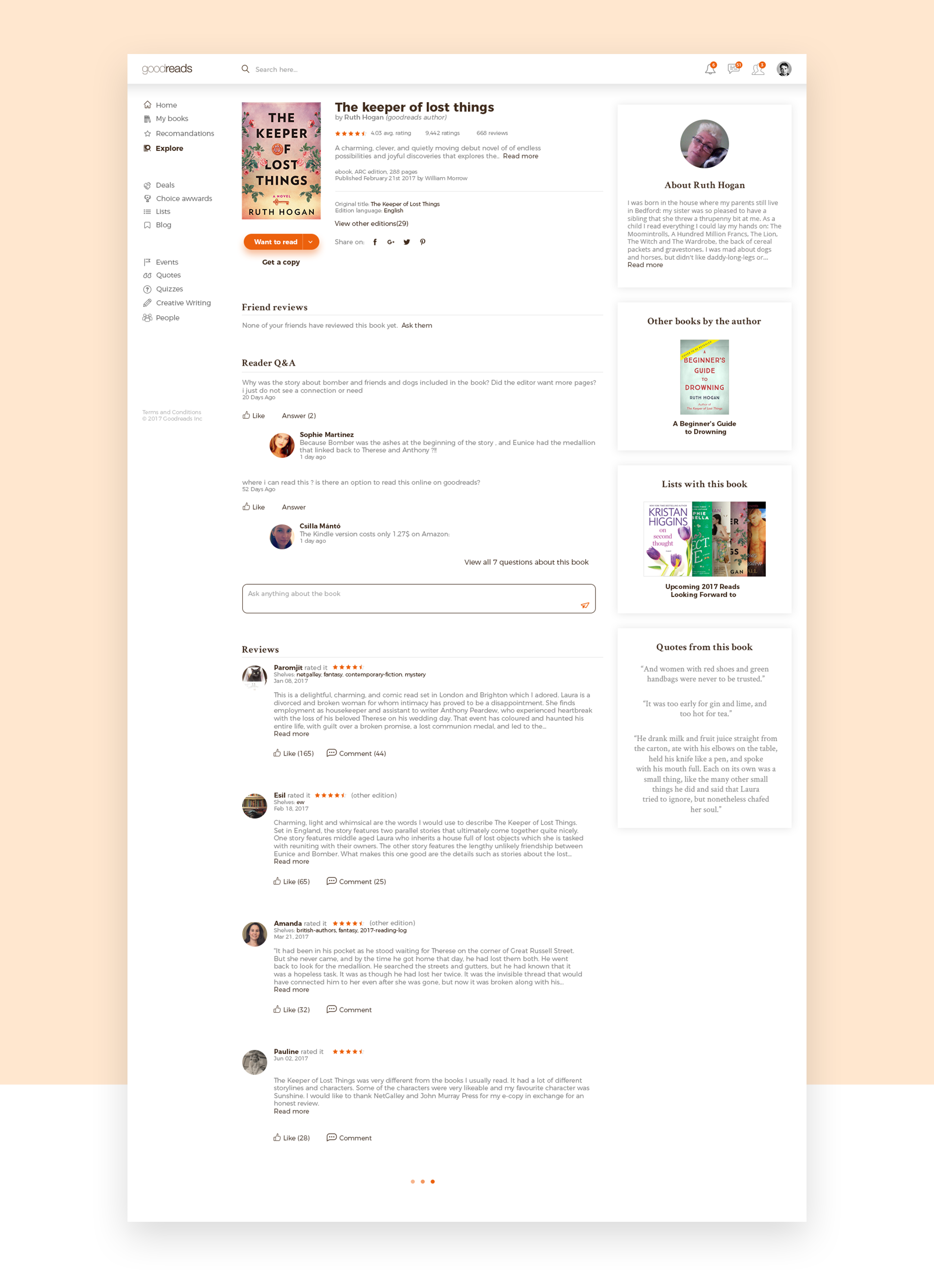
A new way of exploring and recommending books
Notification panel - faster access for all your notifications
A cleaner search system
A new social experience
Chatting with friends on Goodreads is currently based on a mailing system which is a considerable impediment to an immediate communication. Everyone loves instant messaging, so we designed an easy-to-access chat system that can be used either with chat boxes or as a full screen for those endless disputes about J.R.R. Tolkien vs. George R.R. Martin.
Goodreads chat - communicate directly with your friends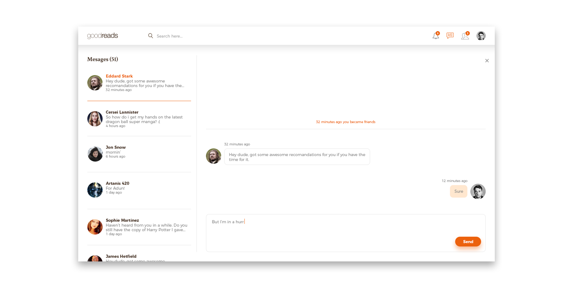
Fullscreen chat for amazing conversations
Behind the scenes
Spoiler: this is merely a fun project that does not follow our clients' usual creative process.
This is a High Contrast contribution to the community we are proudly part of. Goodreads hasn't hired us (yet), so we couldn't follow the entire process that we are used to: analysis on accurate data, user behavior insights, client discussions and debriefings, focus groups with users, and many others. This is a visual redesign proposal based on our personal experience with Goodreads, developed with the following resources:72design hours3creative directions hours8account management hours4copywriting hours
What’s next?
Are you excited about a better experience on Goodreads? Share this with your friends, and let's make it real!